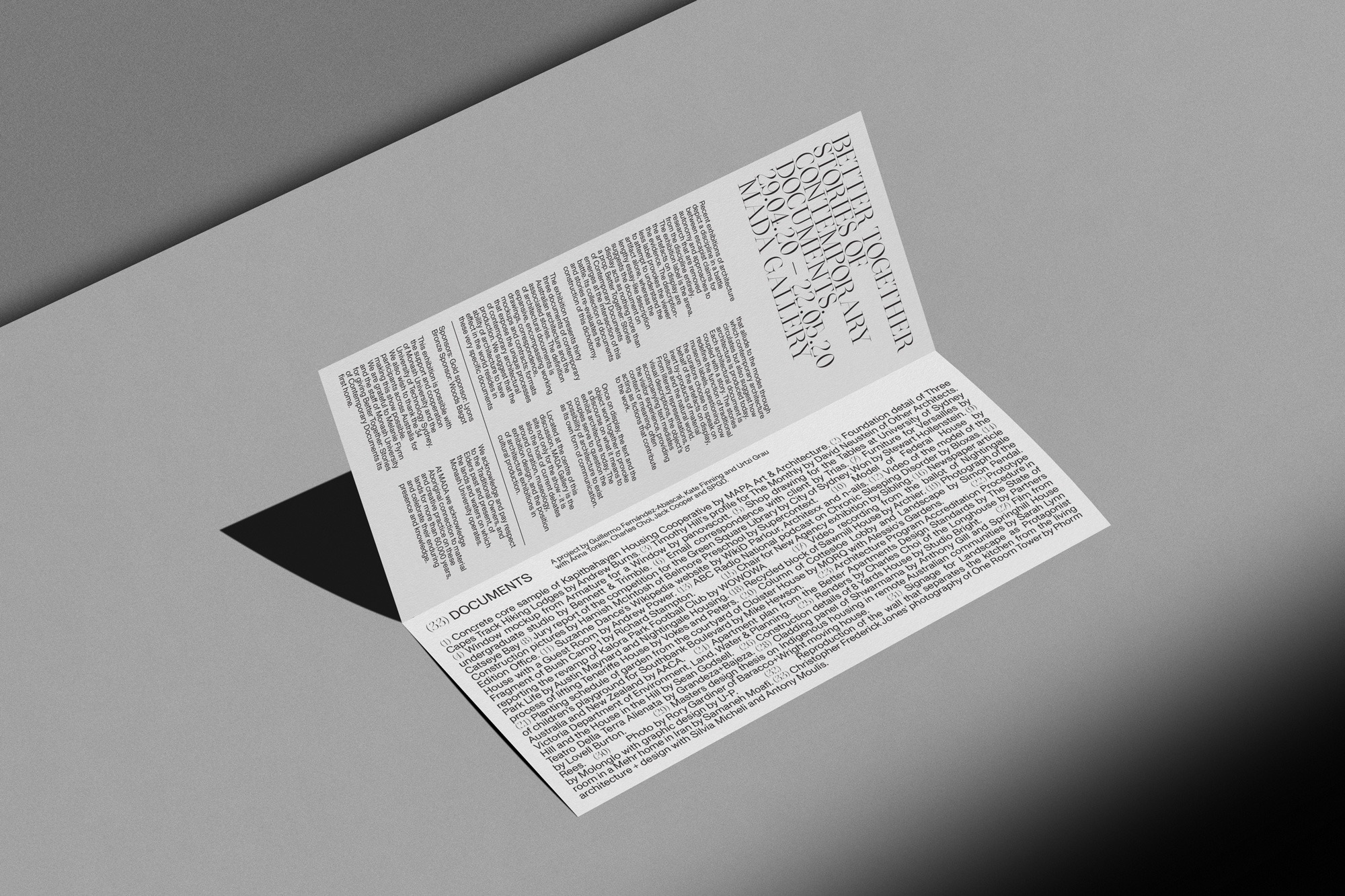
Better Together: Stories of Contemporary Documents (Monash Art and Design Gallery)
The identity was created around 3 main elements. This allowed us to stay within these parameters and being as flexible as possible using these constraints. The logotype was created so the ‘O’ from SOCD would be the flexible/interchangeable element this is where we would be able to have the brand changing based on various use cases. This helped with individualising each designers contribution allowing them to feel ownership within the exhibition whilst also allowing them to share through social media their particular contribution image/number associated to the works whilst still maintaining the overall brand identity.
The line-work was created as the graphical illustrative nature to add interest and movement through the identity, we created these patterns based on the movement one would navigate through the exhibition. This allowed the pattern to constantly change and give us multiple variations of line-work to use and differentiate through the identity.
Another detail we wanted to introduce was the use of the entry flag to be tangible this help emphasise the idea of bringing the texts to life. Having the ability to walk through the flag that has been split through the centre to have a grand feeling and connected entrance.
