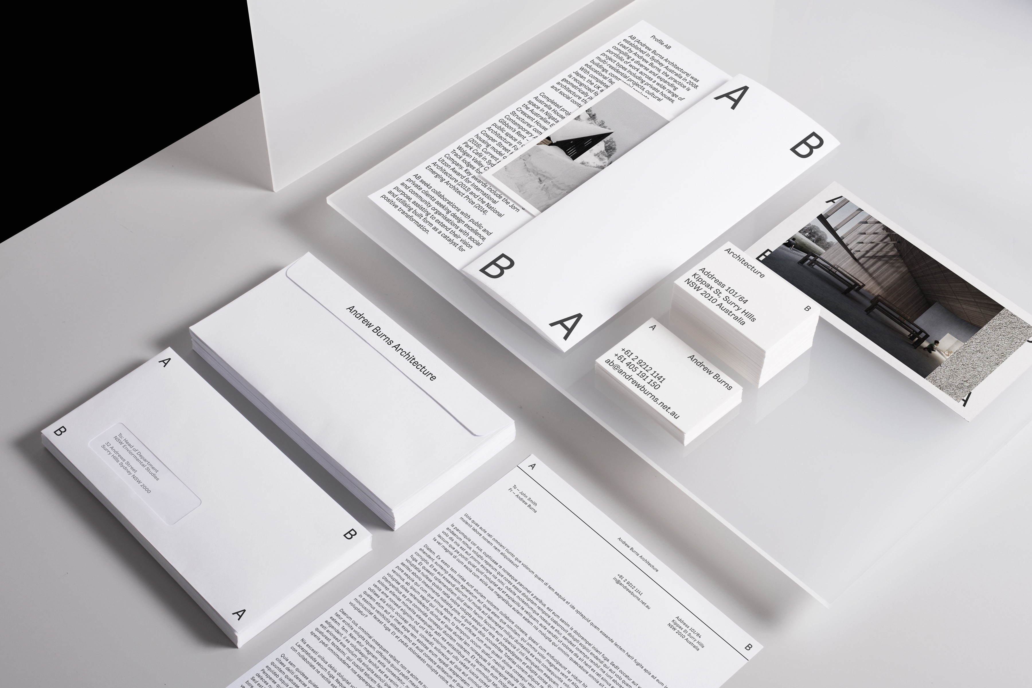
Andrew Burns Architecture are a heavily research based Architecture Office with a wide variety of private and commercial works. The brief was to convey something very minimal, subtle and research oriented graphically. We started by dividing up the practice into 2 sections: Research and Realised. This clearly defined the studio as a parallel practice, so we engaged in the concept stage how best to apply this rule throughout the research and ideation process. We then needed to project this theme in a graphical sense that was not obvious but intuitive. This then led us to explore AB and the reflection of this BA.
The typeface choices were divided into 2 areas dependent on which side of the brand it landed on. For the AB we stuck with a sans typeface with a hint of obscurity. For the BA side we opted for a serif typeface, the clear differences in the body text allowed the identity to inform you subconsciously as to which side of the practice you were engaged in. The outcome is a flexible identity system, this allows the client roll out various sides of the identity in a systematic and economical way. Visit Website
