Application: Website
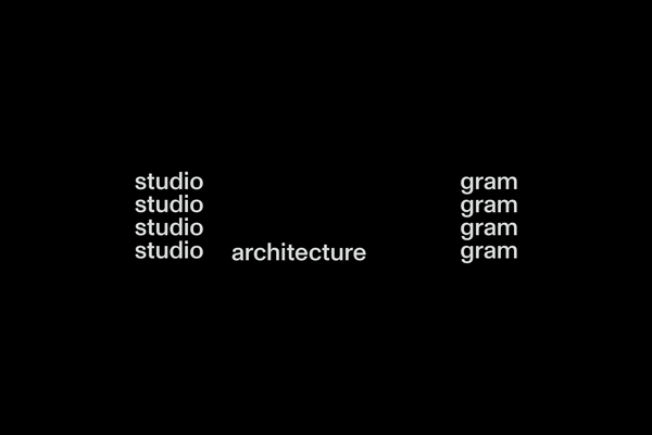
Studio Gram Architects
Kami Copenhagen
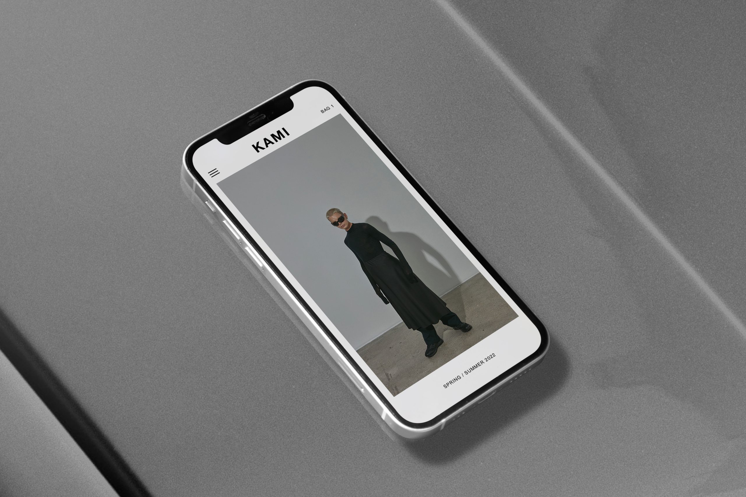
Website design and online store build for fashion label kami Copenhagen.
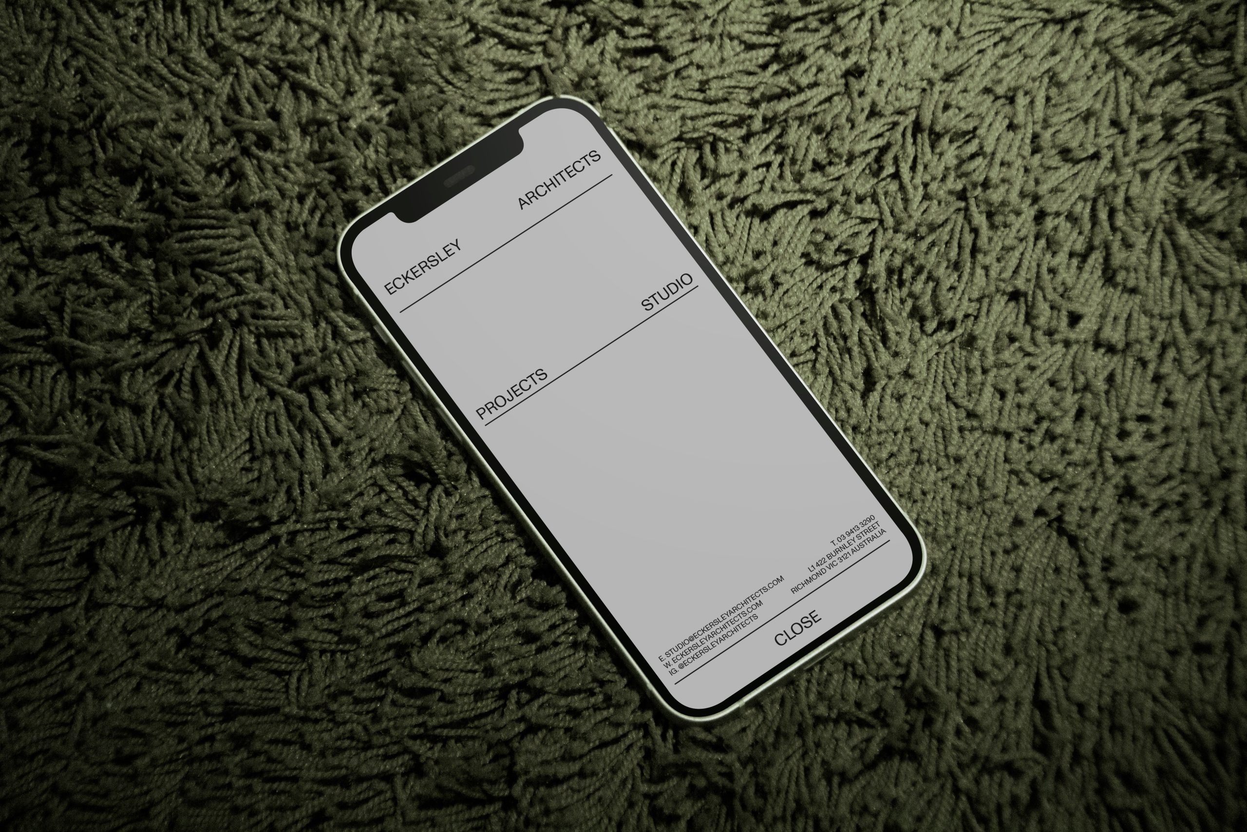
Bone Architects
We were approached by BONE to create a completely fresh brand idenity from the ground up. Extensive amounts of research and development went into creating a theme around archilogical nature, this helped us determin the colour and and approach to the custom logotype.
To offset the historical nature of the theme we introduced bold colour that heavily contrasted the theme to a collision of old and new.
Edicole Book Stand
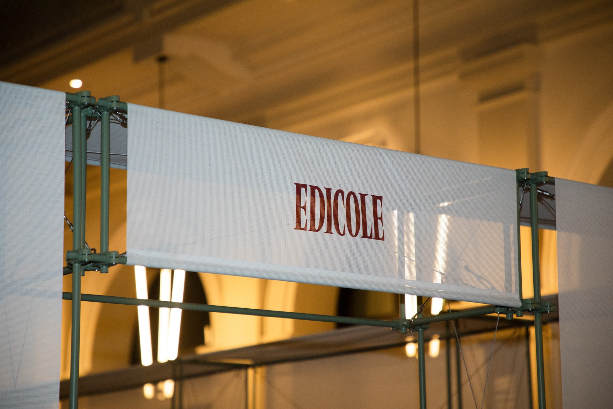
A book store located in the State Buildings Perth WA.
Inspired by traditional Italian newspaper stands in Italy. Our approach was to create a typographical and grid led identity that was structured around a customised grid that was built off the idea of a flexible bookcase.
Custom packaging and Signage was created to be sympathetic to the architecture.
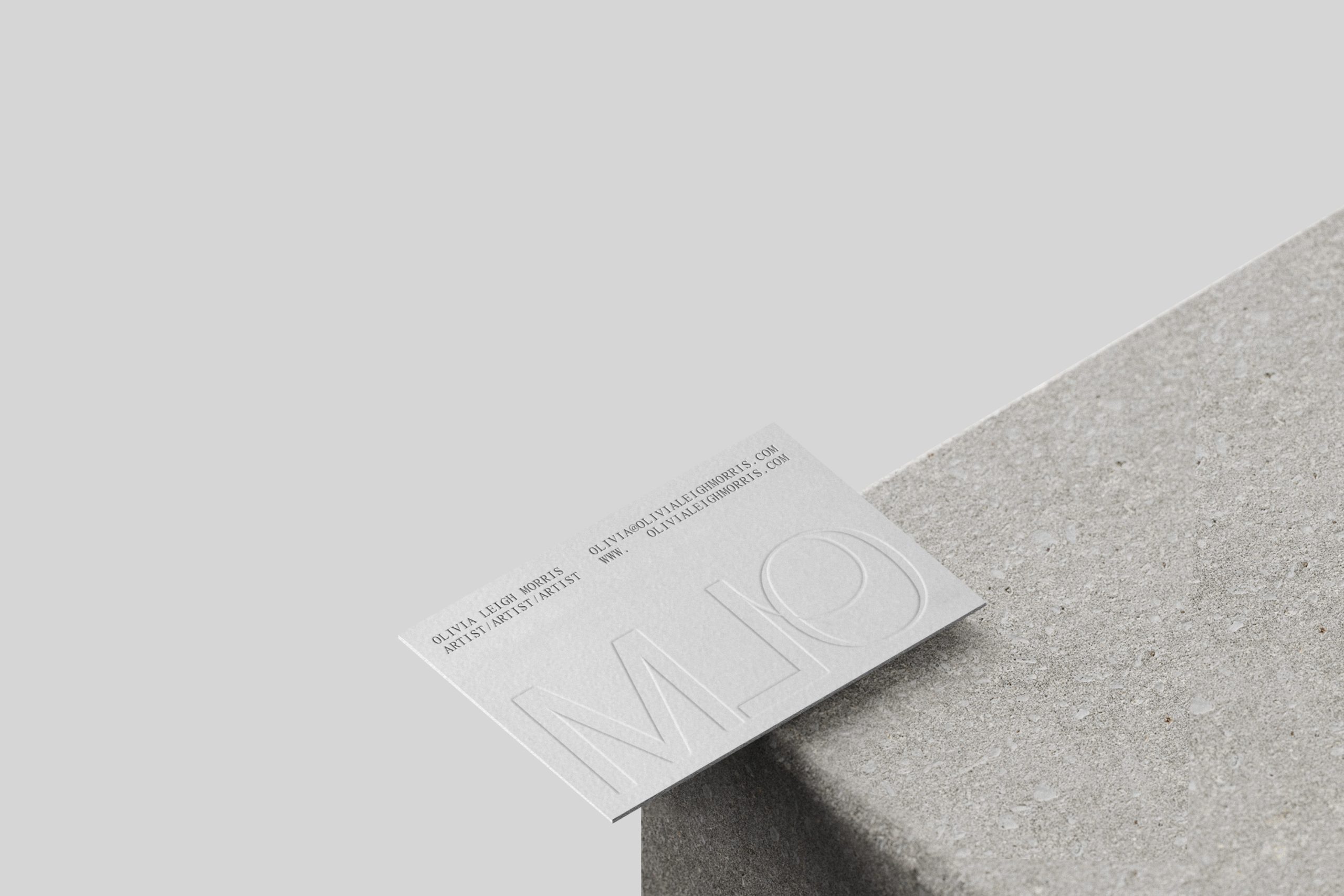
Olivia Morris
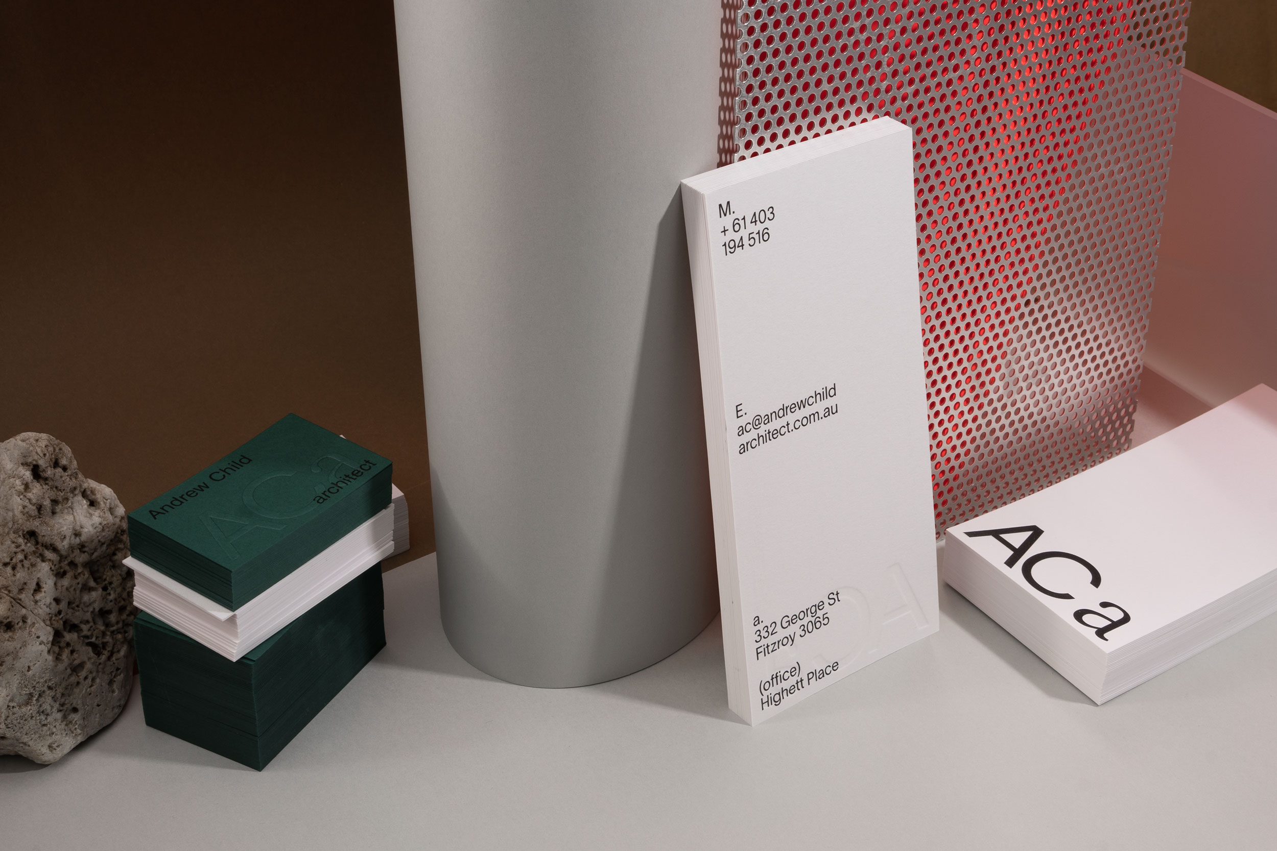
Andrew Child Architect
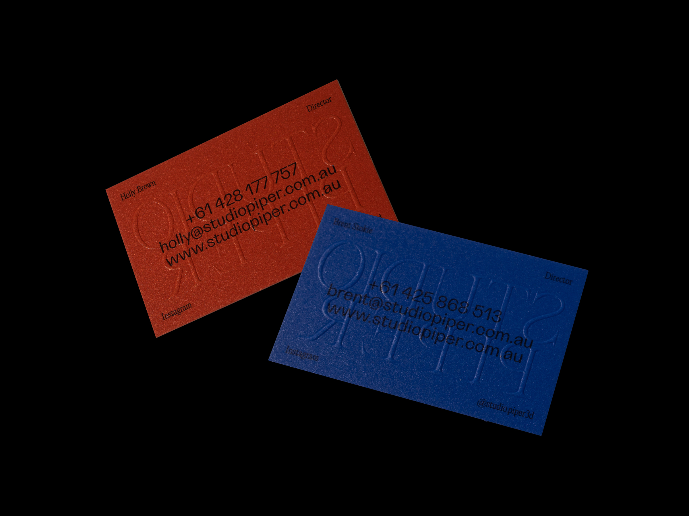
Studio Piper
Ordinary Object
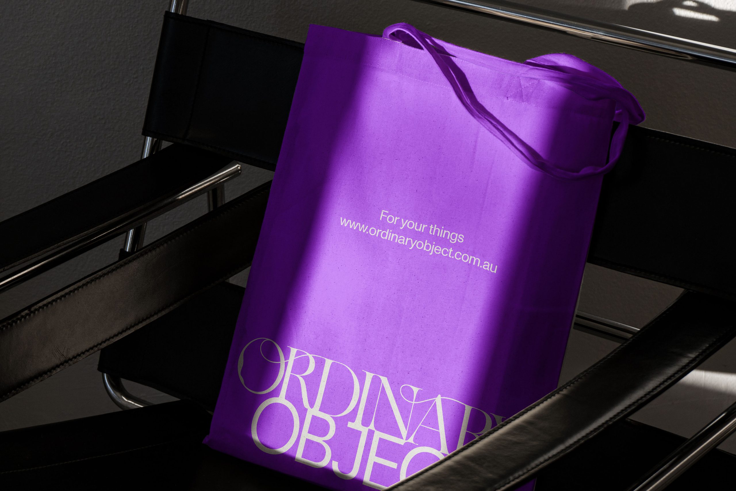
Ordinary Object is a personal inspiration of curated objects which then are either sourced or created by artists for perfected one off pieces available to purchase. We created and intricate custom logotype that pull these values together, paired with a simple and timeless typeface that compliments the content.
V.ROSA
A Jewellery brand with roots from Rome Italy. We created a custom logotype we felt reflected strength and grounding nature of V.ROSA’s pieces. The outcome a bold expressive brand executed with budget conscious deliverables.
Angle Property
Angle is a boutique property development company. We were approached to develop an Identity and full branding that could be applied to various media and formats. The logo was developed from mathematical representations of angles and interaction points. The execution: a wire frame structure that reflects the skeleton nature of building foundations. This project included brand guidelines, marketing collateral through to branded light boxes.
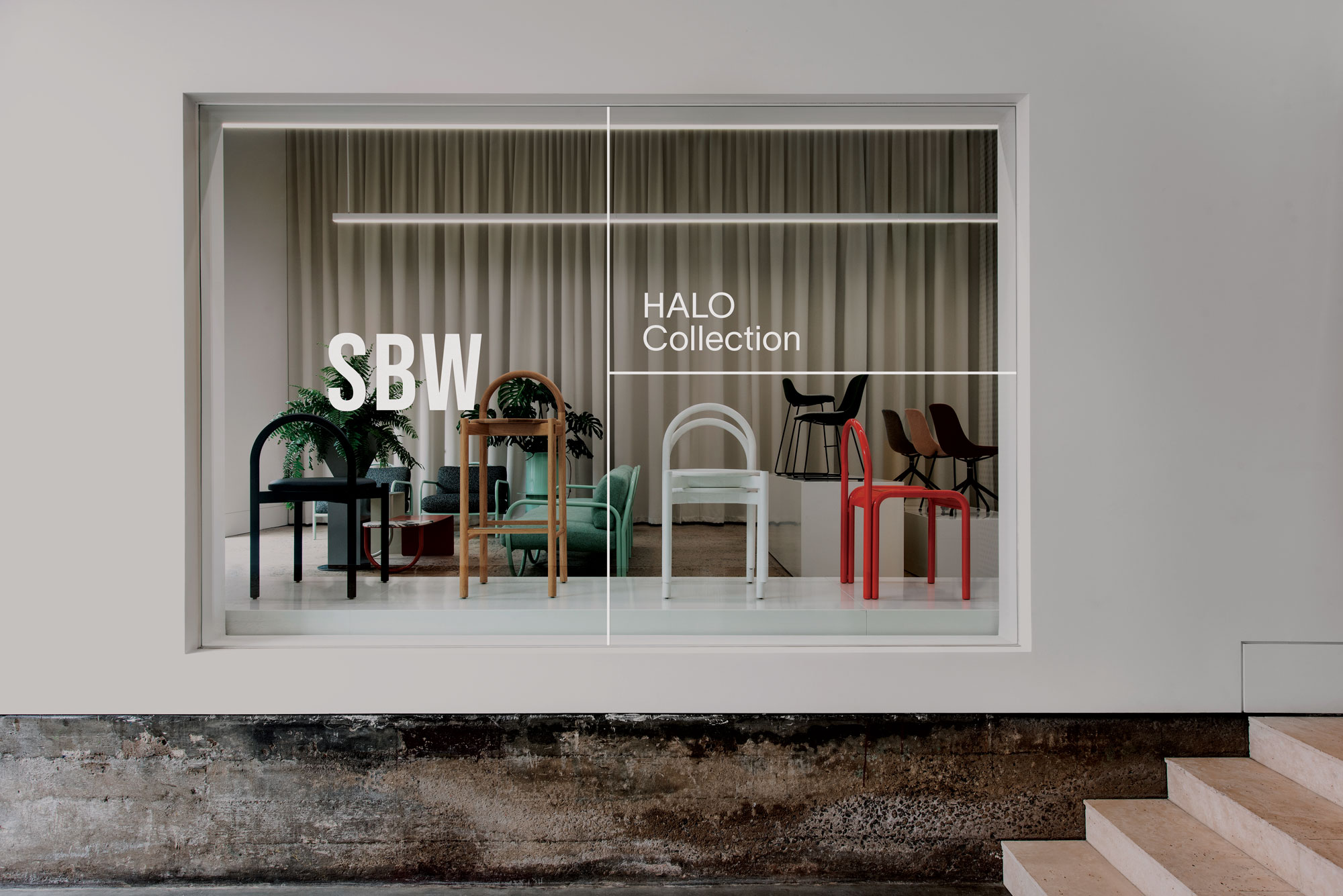
SBW Furniture
Natalie Turnbull
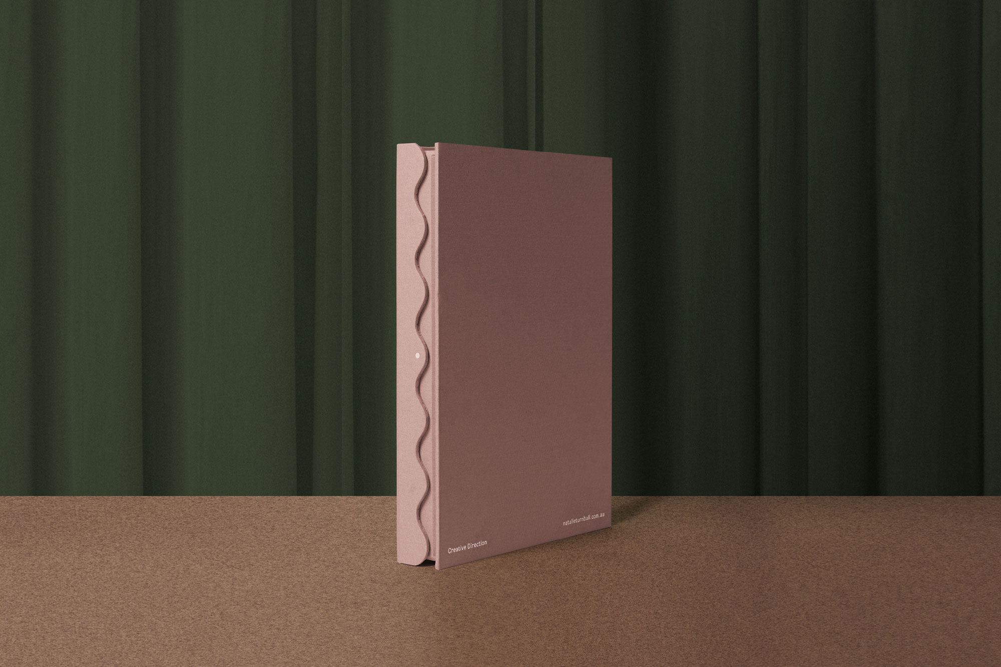
Identity for Natalie Turnbull a stylist based in Melbourne. We created some specialty bespoke packaging and identity that would reflect the slight playfulness and colours that would compliment her personality and style of work. This resulted in animating her existing logo mark and adding supporting typography and graphic elements to create shapes throughout the deliverables that would sit alongside her current aesthetic. We also created a custom portfolio packaging and a custom built website resulting in a cohesive bespoke brand package.
Thomas Coward
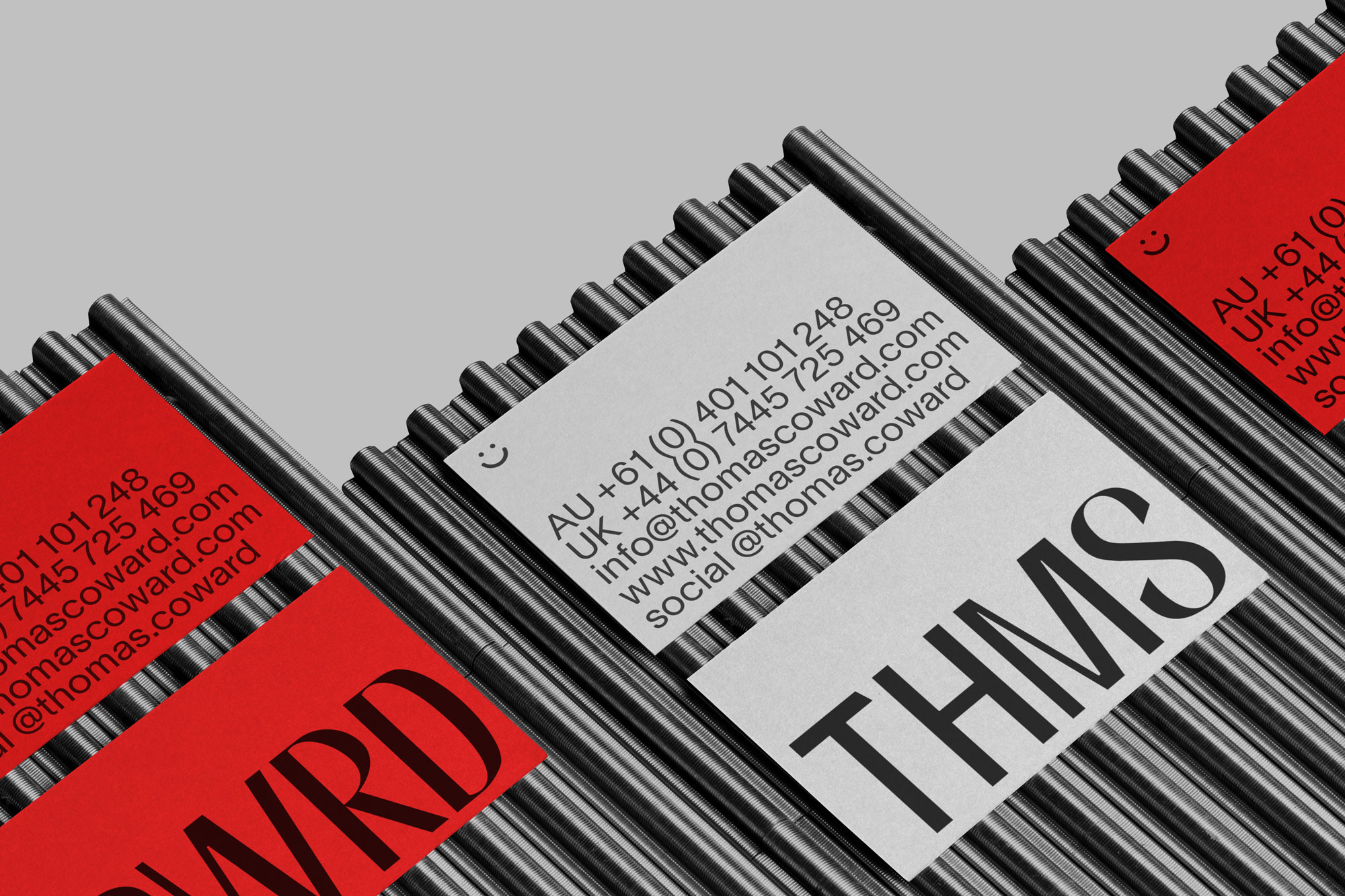
A Melbourne based product designer. We were asked to create a bespoke identity and website that reflected his work and flexibility through a broad range of products and projects he works on. We created a custom logotype drawn from akzidenz grotesk and heavily manipulated and customised to create a completely individual outcome for his practice. An animation was created to great you the first time you visit his webpage which shows of the flexibility and movement of the logotype.
Catseye Bay
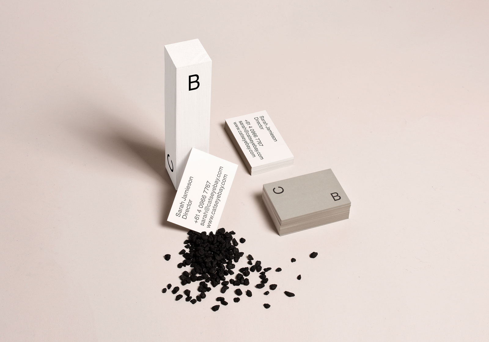
Catseye Bay is a Sydney based spatial design studio. They have worked with such clients as Sydney University Museums, Object Australian Design Centre, Victorian Eco Innovation Laboratory, University of Technology Sydney and Concordia Gallery. We created a system that would adapt to its media and format. The Identity was created loosely on the action of floating between two sides of the bay. The distance between the two letters are adaptable to their media, creating a versatile relationship of space and form.
United Products
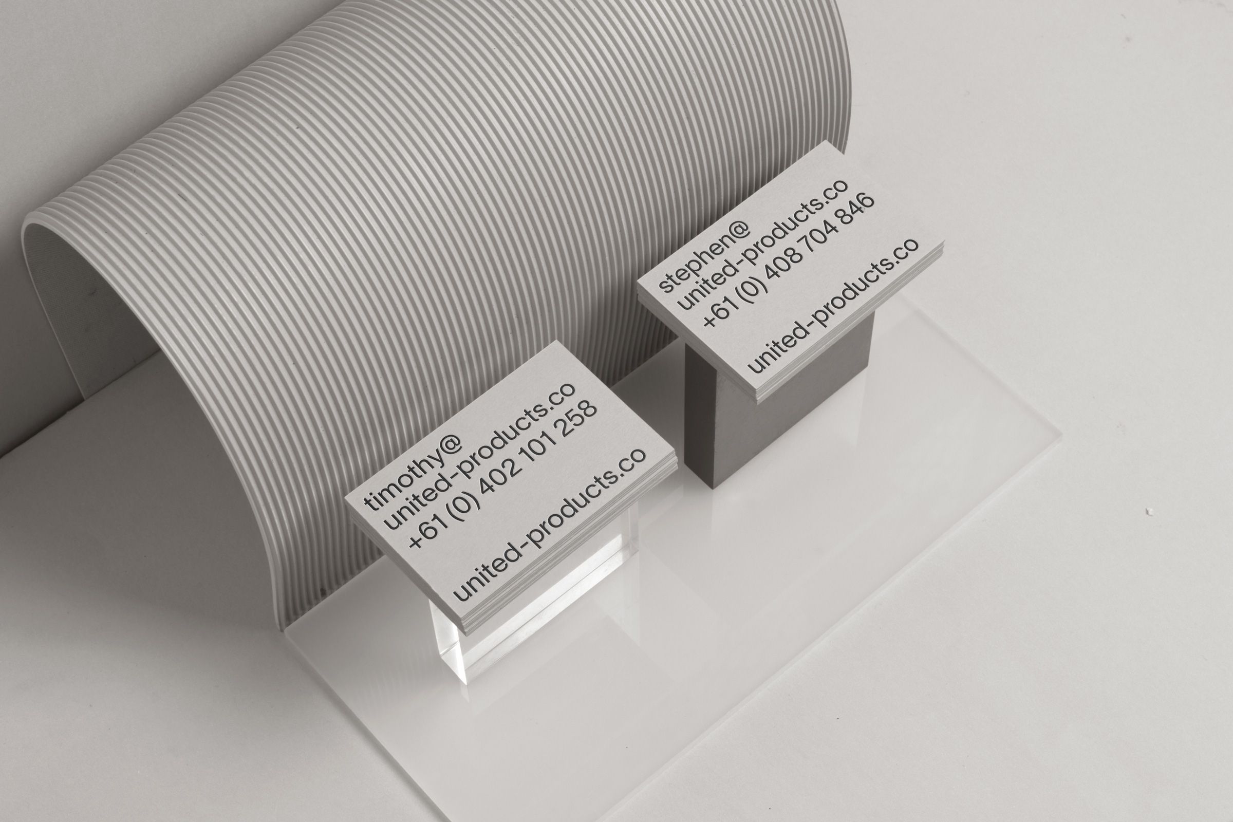
Identity Design for United Products. We were approached by United Products to refresh their brand identity and collateral. This required typeface exploration, animation, printed and digital documents that would unify the vision and aesthetic that United Products needed to portray.
The concept was to find the balance between sleek and playful. The documentation needed to be practical in its legibility whilst adding a little bit of personality and traits the various designers express through their work.
We started by creating a wave animation that was fitting to bathroom products. This was made to move like water but textured like liquified porcelain.
Various deliverables were created and carried through the wave as a recognisable element. We rolled this element throughout the branding, accompanied by the use of layout and typography which gave a strong sense of weight to the overall execution of the brand values.
Nelson Made
Eric Ronald
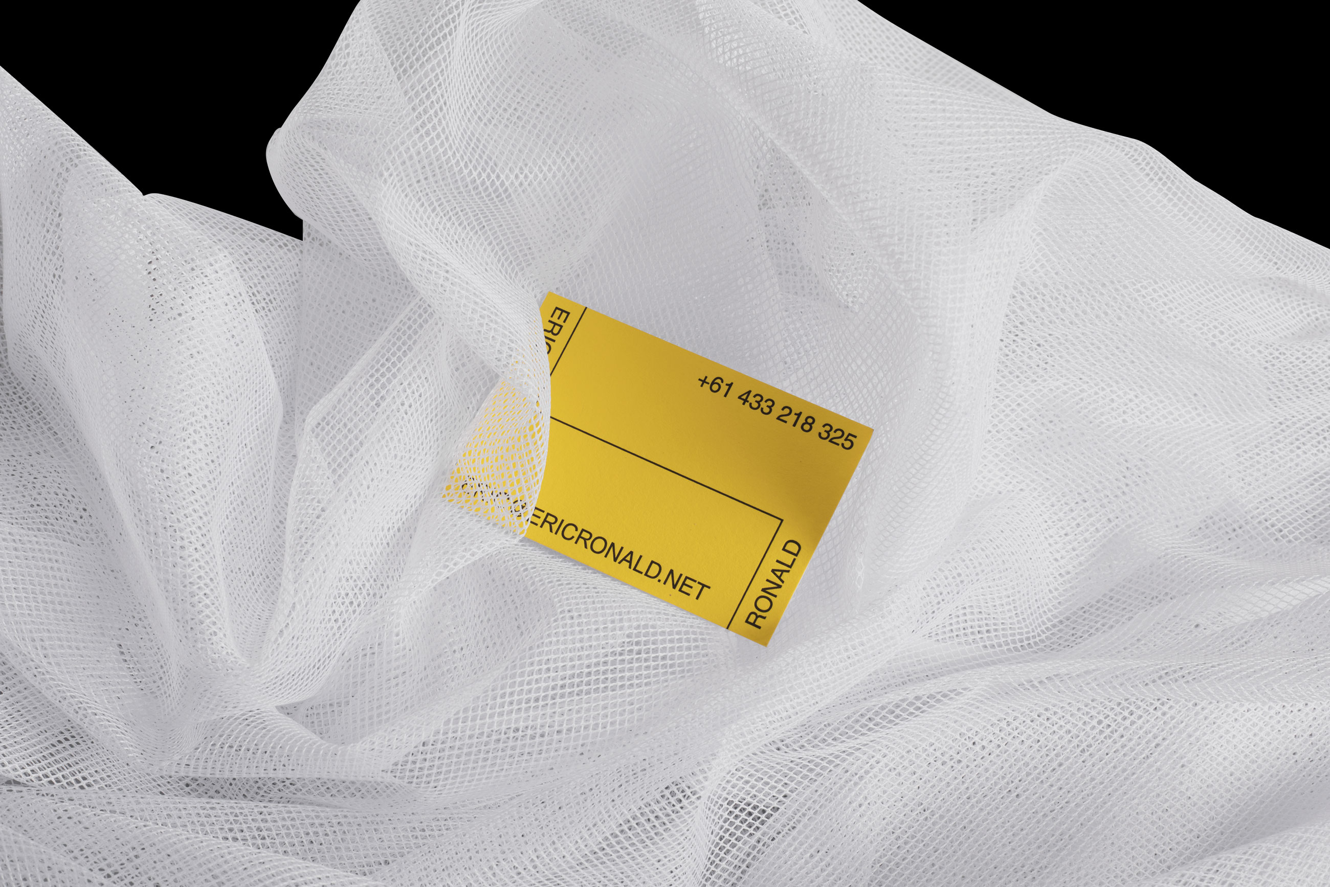
Branding Identity for Eric Ronald an award winning photographer from Melbourne AU.
Eric is always moving and wanted his brand to reflect this without being overly designed. We used this flexibility and let the content inform the shape of the lines separating the 2 main areas that are made up because of this separation.
We are left with an identity that uses bold colour, layout and simple typeface to create a unique and personal outcome.
Folk Architects
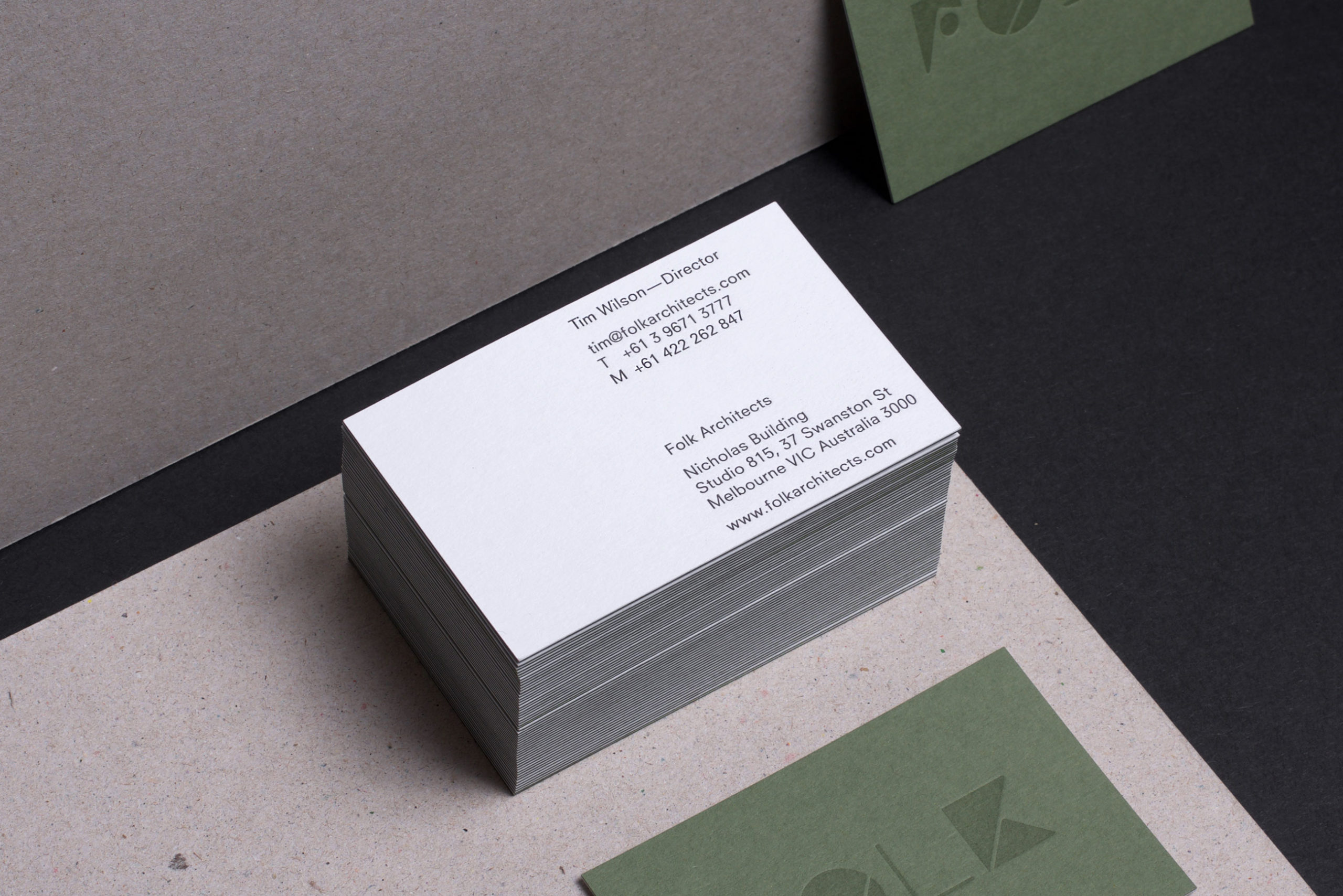
Folk Architects is an award winning architecture studio based in Melbourne. We were asked to refresh their identity and create a website that was functional, easy to use and easy to manage. The project included a whole range of new collateral from invoicing templates to drawing sheets through to stubby holders.
We approached this with focus on materiality, finishes and content were at the heart of the brand refresh. Whilst the outcome has a clean minimal finish we wanted to bring warmth through texture and colour. The outcome is an approachable identity that can be expanded on with the use of colour shape and imagery.